
.jpg)
.jpg)


.jpg)

.jpg)


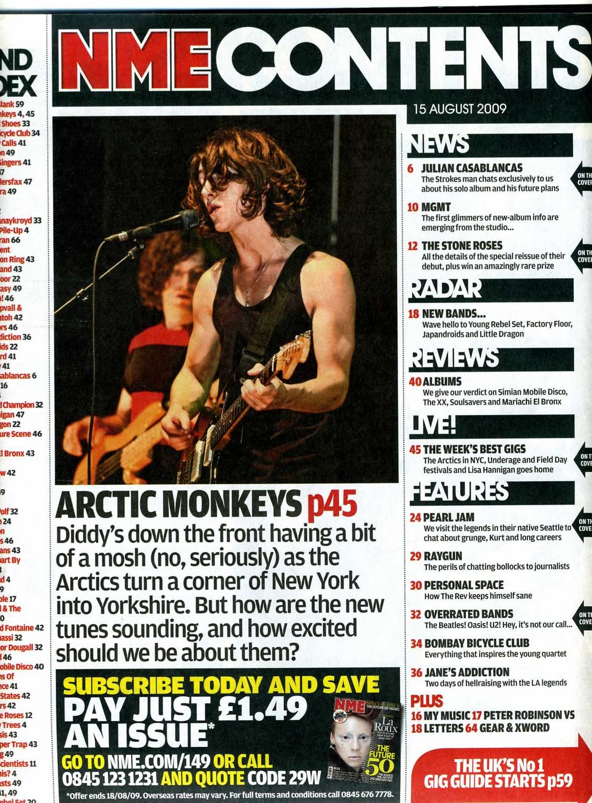 There is only one image on this page and using the rule of thirds it is positioned right in the centre of the page, this is very effective because the audience look straight at the image as soon as they open the magazine. Below the image there is a short description of the image and this is to inform the audience who do not know the artist in the image. At the top of the page there is a contents title and it is simply called 'contents' this is very boring because every other magazine will use this title for their contents page, so the NME are not making it their own here. The title is in bold white font and is in front of a black background, this is good because the font really stands out. Down the right hand side of the page there is a column which states some of the articles that are involved in the magazine, these are all page numbered so that the audience know where to look to find a certain article. There are headings down the right hand side of the page this is to separate the certain articles in to 'live performances' and 'News', this is effective as it shows variation. At the bottom of the page there is a promotion banner, this is used to persuade the audience in to buying another NME magazine. Down the left hand side of the page there is a band index and this shows the audience all of the bands/artists that are involved in the magazine and it also states all of the page number this is so the audience know where to go to find the bands. The bands in the band index are highlighted in red font, this is good because it stands out from the black font on the page and catches the audiences eye. The main background of the page is in white and this is effective because the black and red font that is used stands out and is easily read by the audience.
 The overall layout for this content page is that the main image of the mostly talked about band in the magazine is positioned from the middle to the top right hand side of the page, the image is very large and dominates the whole page, this is good because it catches the audiences eye. Underneath the image there is a description of the band that the image is on, this is to notify the audience of who the band is. The column down the left hand side of the page is gives a list of different artists that are going to be included in the magazine. The columns down the left hand side of the page include page numbers of all the different artists that are in the magazine and this is an advantage to the audience because they may want to turn straight to the page that includes their favourite band. Underneath the first image there is another image on and artist that is included in the magazine. Around this image is another list of artists that are included in the magazine, there is a large amount of information on this page and this is good because it lets the audience know a lot about what is going to be included in the magazine. The title of the page is just a simple 'contents' and this is not very effective because lots of other bands will use this title for their contents page and they do not make it their own. The main image is very indie, with the band in pose, not smiling or making any facial expressions, this makes the them look very cool and indie. The background is just a plain white background and this is good because the black font that is used for the text stands out because it contrasts, however it isn't good because it looks plain and boring.
 This magazine is a older version of the NME magazine and it uses a different layout to the new NME layout of the contents page. The overall layout is that there is a main image in the centre of the page of the main artist and underneath this image there is a description of the image. At the top there is a old NME title 'NME this week' this is good compared to just using the standard 'contents page' title because it makes it their own. Down the right hand side there is a column of information about what is going to feature in the magazine, the information includes the artists that are involved in the magzine. The right hand column has five different headings 'News, radar,live,reviews and features) these are good because it seperates the information on artists into these specific groups. Down the left hand side of the page there is a column which states 'Band index' this is very useful for the audience because they are able to see which bands feature in this magazine. At the bottom of the page there is a promotion of other NME magazines ans this is used to try and make the audience buy other editions of the magazine and this is good for the NME's income. Each piece of information down the right hand side on artists also includes the page numbers of where about these artists will feature in the magazine, this is good for the audience because they know exactly where to find a article on a certain artist. Also all of the bands on the band index have page numbers next to them, this is useful for the audience because they know where to find information on a certain band. using the rule of thirds, the image is right in the centre of the page, this is good because the audience will spot the image straight away.
 The overall layout to this document is that there is a main image (larger image) in the centre of the page, with a description underneath the image and this acts as the talking point of the magazine (main story). Surrounding the main image and description there are other little images of artists and these images also have a description underneath the image. These descriptions are beneficial for an audience who do not know who the artist in the image is. At the top of the page there is a heading which does not state 'contents page' which would appear on a normal magazine but they call it 'inside this week' this is very good because the NME are making it their own and the fact that it appears on all NME magazines shows it's a part of their house style and they are keeping it consistent. The heading 'inside this week' only appears on the more recent versions of the NME e,g 2010 to present. The images of artists are edited with the page numbers in to them, this is beneficial for the audience because they know where about to find information on a certain artist. The page is surrounded with a white background and this is good because the only font that needs to be used is black because it contrasts to white and makes the font stand out. However just using a white background and black font can be very boring and does not show creativity. However though the fact that only black and white is used makes the images stand out because they are bright and contrast to the white background, this then catches the audiences eyes. All of the descriptions that appear underneath the images use a quotation from the artists, this is good because it shows the realism of the magazine because they have interviewed the artist to receive information about them and this shows reliability of the magazine because some magazines may make false information about a artist.