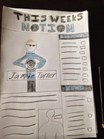
This is my hand drawn design of a contents page. I have gone for a large main image at the left hand side of the page of the main artist, this is to show he's the talking point of the magazine. At the top of the page I have put the contents title, however I have not called the page a standard 'content page' instead iv'e called it 'This weeks notion' this is to make my contents page my own. I have put the description of the main image underneath the image, this is to show the relevance. I have also included a smaller image of another artist and this is to show that the magazine isn't all about the one artist. Down the left hand side of the page I inserted a column which includes a band index and a news section. On the band index I have listed a number of bands and shown what page in the magazine the band will appear in. On the news section i have listed some key talking points of the week and also said what page they are going to appear on in the magazine. The colour theme that i have used is dark blue and black, I have used these colours because they contrast well and look appealing to an audience. I explained further why i used these colours in the resea
No comments:
Post a Comment