Monday, 30 March 2015

Front cover (updated)

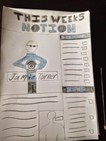
This is currently where I am at in terms of my front cover.  I have made changes based on the feedback I received last week.  Changes such as:
1.  Added a border to the 'notion' heading to make the heading look more appealing 
2.  Increased the size of the 'jamie turner' font so that it is clearly noticed as the main text for this magazine.
3.  Added in basic features such as; the date and the price.
4.  Added in extra information such as; '5 double page image of bands' and 'interviews with'
5.  And finally I changed the font to the left and right hand side of the models head and added a box around the text to make the text more aesthetically appealing to an audience

Improvements
1.  I used a wide variety of different fonts and during my research tasks I said I wasn't going to do this, so I need to reduce the number of fonts I am using.
2.  Also the colour of the fonts are consistently the same, I think I should change the colour to add a better visual effect.
3.  I still think there is improvements on the boxes of text as they don't look the best at this moment.

Monday, 23 March 2015

First draft feedback sheet

This is the feedback sheet that I recieved for my first drafts of my maazine, the points along the top are improvements and the points along the bottom are positives of my first drafts.  As you can tell there are more improvements than positives for my first drafts, however I did expect this.  First of all for the front cover people said that they liked my title name and font, however to improve this i could have added a banner to make the title look more professional, to do this i will add formatting to the title, such as lines and boxes.  People also think that I should add some more formatting overall and also agree to this point.  People also said that they liked the attitude in the photo and i may keep this photo for the front cover or if i was to retake it i will make the model do the same pose.  The font that i used for the content page was not the best and i knew this before i got feedback and i am going to look at my style models and discover the best font to use for my conents page.  However people said that they liked the layout of my content page and i will keep the layout similar for my final document.  For the double page spread i knew that before i got feedback the image was too bright and i knew that this photo was always a risk because of the brightness of the graffiti in the background of the image, for my final document i will use an image preferably in the studio. People did sa they liked the font for 'jamie turner' and this was a font i downloaded and i also like this font so i will definitely use it for my final document.

First draft contents page

This is the first draft of the contents page for my magazine.  Overall I feel that this page is the worst out of the three that I have created and I think this is mainly because I spent much less time on this page.  However I really like the layout of the page and I will use this layout for my final draft.  I also like the heading ' this weeks notion' because it makes the magazine sound personal instead of just 'contents page' for example.  I also like the colour theme as they match the overall colour theme of my magazine to show the consistency.  Finally I also like the image as it looks very urban which meets the indie theme of 'in the city'.  However I do not like the font for 'this weeks' as I think it looks very bubbly, to change this for the final draft I will design my own font like I did for the 'notion ' font.  I do not like the image at the bottom of the page I think it completely doesn't match my indie theme and this photo will be taken again for my final design.  For my final design I need to left justify all my text so that they are aligned correctly, this will make the text look more appealing and professional.  I also think that the font used is not suitable to match my theme and for the final version I will look in to fonts further on magazines such as the NME and Q and see what style font these magazines use.  Overall u feel that this page needs a lot of Changes before the final deadline.

First draft double page spread

This is my first draft for the double page spread on my magazine.  I decided to go for a different style on this double page spread and test a image that uses a graffiti wall as the background.  This could have either went one way or the other and I feel that it went badly.  First of all the image is just far too bright for a double page spread and this lead to the text being very hard to read.  However I think the positioning of the image is very good with the model over to one side of the image and the rest the graffiti.  I ides a number of different techniques to try and make the image less bright so that the text was readable, I firstly made a transparent text box which does work and you can read the font at a close distance, however I wanted the audience to be able to read clearly from a fair distance.  I then went on to blurring the image on Photoshop and I decided to blur the whole image other than the model and this was so that the focus is all on the model and this worked out very nicely.  Although the image did not work I really like the fonts I've used for 'jamie turner' etc and I have used then consistently throughout the magazine which shows professionalism.  Overall I know that the double page spread image needs to change for my final draft as this image is just too bright!

First draft front cover

This is the first draft for the front cover of my music magazine.  I decided to locate my image against a brick wall with the model showing a lot of attitude in the facial expression and this is to show the indie arrogance and swagger.  The day was overcast when I took this photo which was good as it didn't make the image too dark or too bright.  Also I got the model to wear sunglasses even though it wasn't sunny and this was to back up the indie 'coolness'.  I went for a font called 'colours of autumn' for the 'Jamie turner' text and for the text on the wall, I thought this text was good as it looks very graffiti like which matches the theme of this magazine.  However for the font on the wall I could have maybe changed the colour of it so it is easier to read.  I really like the 'notion' heading that I designed and I think it really links in with the indie theme.  To improve I feel that I should have added more formatting to make the front cover look more appealing and professional.  I also feel that the 'jamie turner' font should be much larger so that the audience can clearly tell that he is the man on the image and that he is the main talking point if this magazine.

Saturday, 14 March 2015

Initial images (contents page)

Initial images (contents page)

This is my inditial image for my contents page, before any editing.  The location of this is also at The Sage in Newcastle.  I have chosen this location because the area looks run down for example, the fences make it look very run down and also the fact that there is a big building in the background backs up that it is an urban area, so it is a rund down urban area.  This type of area is good because it is as if the artist is saying that music is the only way out of this area and this is key for a new artist (which my artist is).  The model is holding a vinyl prop, this is good to promote the artists new album as well as making the model look very cool and old school (usage of the vinyl).  The model is weaing the same clothes as he is on the double page spread which shows the shoot was on thesame day (which occurs on actual mgazine photoshoots).  I also made the model show a lack of facial expressions to show that the artist is keeping the indie coolness and swagger consistent.


Initial images (double page spread)

This is my first draft image of my double page spread.  The location of the image is at the graffitti walls at The Sage in Newcastle.  I chose this location because the graffitti symbolizes a run down urban area and this is good because the image is basically saying that music is a way out of this run down life.  Also the graffitti is very good for a visual effect as it displays vibrant and different shapes and words.  I have got the model to stand to the left hand side of the image so that graffitti on the right hand side is clealry on show and also it is so that the article is on one side of the page and the image is on the other side.  I got my model to wear a bomber jacket and sunglasses, this is to make him look very cool and indie.  I also made my model have one foot up against the wall, this is to make him look like he doesnt really care about the photo and he can do what he wants and this meets the indie genre as lots of indie artits don't care about a photoshoot.  Finally I also made the model have no facial expressions at all, this is to show the coolness and swagger of the model, this is used often in indie magazines.

Friday, 13 March 2015

Initial ideas contents page

Initial ideas

This is my hand drawn design of a contents page.  I have gone for a large main image at the left hand side of the page of the main artist, this is to show he's the talking point of the magazine.  At the top of the page I have put the contents title, however I have not called the page a standard 'content page' instead iv'e called it 'This weeks notion' this is to make my contents page my own.  I have put the description of the main image underneath the image, this is to show the relevance.  I have also included a smaller image of another artist and this is to show that the magazine isn't all about the one artist.  Down the left hand side of the page I inserted a column which includes a band index and a news section.  On the band index I have listed a number of bands and shown what page in the magazine the band will appear in.  On the news section i have listed some key talking points of the week and also said what page they are going to appear on in the magazine.  The colour theme that i have used is dark blue and black, I have used these colours because they contrast well and look appealing to an audience.  I explained further why i used these colours in the resea
rch.

Tuesday, 10 March 2015

Vinyl 2 (finished heading)

After I had taken the images of the vinyls I edited them on Photoshop by using tools such as; the brush to colour in blue parts of the vinyl, the healing tool to improve the quality of the image, the rubber tool to erase unnecessary parts of the image and the merge tool to add two images together.  Once I had applied all of these changes I then saved it as a PDF file and it saved on a firework file and this is the outcome of the vinyl image (image below).  The final name design is the image that is above the text.


Monday, 9 March 2015

Vinyl

These are some images that I have taken of vinyls that I will use as the O's in my magazine name, I have taken these images because I can not take images off the internet.  After taking these images I am now going to edit them on Photoshop so that they look more appealing and professional.


Sunday, 8 March 2015

Notion Name Design 2

Name Design

This is another design that I have made for my magazine name 'notion'.  I created the main text using word art font, having a dark blue fill and a black outline of the text.  I picked these two colous because they look very appealing when they are put together.  For the two O's in Notion I have replace just standard letter O's and replaced them with two records, these make the name look very appealing and they also add the music effect to the name to show that there is a purpose to the design, they also match my indie theme.


Initial ideas double page spread

Double Page Spread 

This is my first initial idea for a double page spread.  The image will cover the whole of the two
pages, however the artistwill be positioned on the left hand side of the page and the article writing will be on the right hand side of the page.  The location of the image will be in an area where there is a wall of grafiti, i have chosen this location because grafiti is a sign of a run down area and my model is going to be standing next to this grafiti with a guitar and the guitar prop is used as if the artist is saying music is my way out of this area.  The model will be standing with one foot on the wall, this is to show the models coolness and swagger.  The grafiti in the background will be slightly blurred out and the focus will be on the artist to show that it is all about him.  The writing on the right hand side of the page will be in columns and i have drew 3 small columns but I have decided I do not like this and I am going to change it to three columns instead.  I have drew a box with jagged lines and inside there is a quote from the artist, however the jagged lines makes the image look very unprofessional so I will propbably not use this for my final design.  The page numbers appear in the bottom far corners of the pages.  The magazine name appears in the top left hand corner of the left page and this is so that the audience notice it, hence they read left to right.  There is going to be no information down the spine of the page and this is good because no information is lost.  Other pieces of formating such as a drop capital and dividers between the columns of text will also be added in to the page for the appearance of the magazine.  The artist name will apear nect to the image of the artist to show that the name is about the person on the image.

Friday, 6 March 2015

Magazine name design

Notion Design Name

This is one design that I have came up with for my magazine name.  I drew it in black ink to get a bolder style of drawing.  My original design will be highlighted in blue to make the name look more visually appealing to the audience.  I have made the O's in Notion into images making them look live records, I have added this affect to show to the audience that the magazine is definitely about music and also the O's add a very psychedelic and psychedelia is used often in indie music.  The main font is in block font and this is used so that it stands out and looks more like a heading.  To improve this design insteadof draws the two O's I will add in images of records to make it look more appealing.

Magazine name

Magazine Name

For my magazine name I had came up with four ideas, one which included the 'notion' and this is my preferred name idea.  I created a questionnaire and one of the questions asked what name people preferred and they also said they thought 'Notion' was the best name.  I came up with notion because i was listening to a song which included the word 'Notion' and I straight away thought this was an interesting word, however I did not know the meaning so I searched it up on google to see if the name was suitable for my magazine name.  The definition of notion is 'a conception of or a belief about something' after reading this definition I instantly knew it was suitable for my magazine.  When people ask me why I am calling my name notion i respond by saying 'the definition of notion is about something you believe in and this is good because it is basically saying people should believe in my magazine and read it'.


Wednesday, 4 March 2015

Questionnaire

Questionnaire

For the first question on my questionnaire I asked an audience if indie music appealed to them and gave them an option of yes, no or some.  6 people said they did like indie music, 1 person said they did not like indie music and 3 people said that they liked some indie music.  The fact that a number of people said they do and don't like indie music shows that i have branched out to a wide audience.  The second question was asking them if they read music magazines often, this question was made so that the audience can give me some ideas based on the regularity of how often they read magazines.  Three people said they read magazines weekly and gave me some ideas that I should have my magazine name in blue, this is based on their viewing of indie magazines.  The next question I asked was what colour appeals to you the most as an indie audience?   6 people said that dark blue appealed to them the most, I then asked one person why they chose this colour and they answered 'Dark blue isn't used by any indie magazine, the predominant colour used is red in the NME and Q so dark blue would make your magazine different to other indie magazines'.  The final question i asked the audience was what music magazine name sound the best?  One option I had was notion and 8 people said they preferred notion out of the four options, I will be uploading a blog post on the meaning 'notion' in a future blog.

Tuesday, 3 March 2015

Initial ideas front cover

Initial Ideas

These are my first hand drawn initial ideas of my front covers, there are three designs to show the revolution of the three ideas.  I had to make three different copies because i realized things that were wrong with each initial front cover.  For the first idea on the far left of the image i firstly drew the image of the model and i instantly realized that it was not the right size of what i was aiming for.  I was aiming for a medium close up and i drew a long shot and i realized that to change this I had to draw the models head larger.  On the second initial idea I also drew the model first and I did draw it the right size this time, however i realized that I wanted the persons shoulders touching the sides of the magazine and this lead to me creating a third and final initial idea.  For the last idea of a front cover I started by drawing the artists shoulder and then drawing the head, this was to make sure that the image was meeting my needs and it did.  I then went on to add props to the drawing of the model, i added sunglasses and a bomber jacket which are two typical props for an indie artist to show their coolness.  I then added the bar code which was at the bottom right hand side of the page this is so that it is out of the way and not recognized by the audience because the bar code is not relevant.  I then added the box at the top right and this is to represent where my magazine name is going to go.  I added lots of boxes around the main image and these are there for different stories that occur in the magazine.  Finally i added a main box going across the image and this is there as a heading for the artist on the front page.