Thursday, 26 February 2015

Contents page 5: Q magazine

I have decided to analyse this contents page that occurs in Q magazine because the image on the page looks very indie and also Q is a indie magazine and my magazine is going to be based on indie rock so analysing this will be beneficial for me.

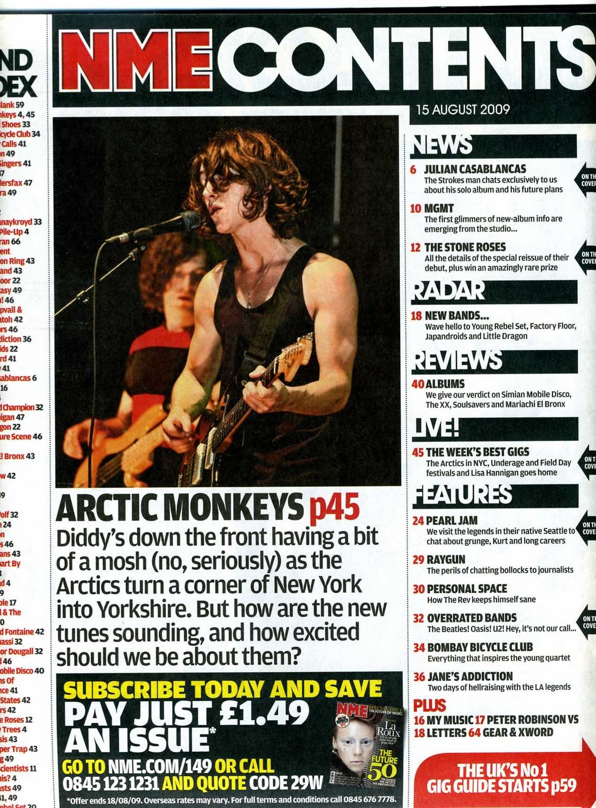
The image that is on the page covers up around 2/3 of the page, this infers that the magazine is going to be aimed around the artist in the image because he is dominating the contents page.  The image is very indie because the artist is looking away from the camera and doesn't really care about the camera, this is showing typical indie 'swagger'. The image has a page number formatted to the image, this is beneficial for the audience so that they know where to go to find an article on the artist in the image. The title is highlighted in a red background and this is effective because it's keeping up the Q magazine colour theme and making it consistent.  The title appears at the top of the page and it is called 'contents' this is very boring because mainly all of the other magazines use this title for their contents page, to improve this they could have made it their own like the NME did by calling it something like 'New this week'.  There is another image at the top left hand side of the page, this is good because it shows variation of the artists in the magazine.  Underneath the smaller image there is a column that shows other artists that have a article in the magazine and these artists that are listed are page numbered so that the audience know where to go to find an article on a certain artist.  The main background is in a white background and this is effective because the red and black font colours stand out and are easily read by the audience.  For some piece of important text there are little pieces of formatting underlining this text to and this is effecive because it makes the text stand out.
For my overall contents page I will also use more than one image to show variation of my magazine.  Finally I will also ad formatting to certain pieces of font so that the font stands out compared to normal font.

Contents Page 4: NME magazine

I have decided to analyse this contents page in the NME magazine mainly because the NME is the home magazine of indie music and my overall magazine is going to be based on indie music.

There is only one image on this page and using the rule of thirds it is positioned right in the centre of the page, this is very effective because the audience look straight at the image as soon as they open the magazine.  Below the image there is a short description of the image and this is to inform the audience who do not know the artist in the image.  At the top of the page there is a contents title and it is simply called 'contents' this is very boring because every other magazine will use this title for their contents page, so the NME are not making it their own here.  The title is in bold white font and is in front of a black background, this is good because the font really stands out.  Down the right hand side of the page there is a column which states some of the articles that are involved in the magazine, these are all page numbered so that the audience know where to look to find a certain article.  There are headings down the right hand side of the page this is to separate the certain articles in to 'live performances' and 'News', this is effective as it shows variation. At the bottom of the page there is a promotion banner, this is used to persuade the audience in to buying another NME magazine.  Down the left hand side of the page there is a band index and this shows the audience all of the bands/artists that are involved in the magazine and it also states all of the page number this is so the audience know where to go to find the bands.  The bands in the band index are highlighted in red font, this is good because it stands out from the black font on the page and catches the audiences eye.  The main background of the page is in white and this is effective because the black and red font that is used stands out and is easily read by the audience.
In my magazine i will also use a band index but however not call it 'band index' this is so that i make the band index my own.  My main image will also be in the centre of the contents page, this is so that it is noticed straight away by the audience.

Wednesday, 25 February 2015

Content age 3: Q magazine

I have decided to analyse this edition of Q magazine because Q is the next most indie magazine to the NME and my magazine is going to be based on indie music.  I also chose it because the image on the page looks very indie.

The overall layout for this content page is that the main image of the mostly talked about band in the magazine is positioned from the middle to the top right hand side of the page, the image is very large and dominates the whole page, this is good because it catches the audiences eye.  Underneath the image there is a description of the band that the image is on, this is to notify the audience of who the band is.  The column down the left hand side of the page is gives a list of different artists that are going to be included in the magazine.  The columns down the left hand side of the page include page numbers of all the different artists that are in the magazine and this is an advantage to the audience because they may want to turn straight to the page that includes their favourite band.  Underneath the first image there is another image on and artist that is included in the magazine.  Around this image is another list of artists that are included in the magazine, there is a large amount of information on this page and this is good because it lets the audience know a lot about what is going to be included in the magazine.  The title of the page is just a simple 'contents' and this is not very effective because lots of other bands will use this title for their contents page and they do not make it their own.  The main image is very indie, with the band in pose, not smiling or making any facial expressions, this makes the them look very cool and indie.  The background is just a plain white background and this is good because the black font that is used for the text stands out because it contrasts, however it isn't good because it looks plain and boring.
For my overall contents page I will also include more than one image, this is to show the variation on the page.  Finally I will also include a column which states things that are included in the magazine, this is to inform the audience.
Contents page 2: NME magazine

I have decided to analyse this edition of the NME magazine because the NME magazine is a very indie magazine and this is what my magazine is going to be based on, indie rock.

This magazine is a older version of the NME magazine and it uses a different layout to the new NME layout of the contents page.  The overall layout is that there is a main image in the centre of the page of the main artist and underneath this image there is a description of the image.  At the top there is a old NME title 'NME this week' this is good compared to just using the standard 'contents page' title because it makes it their own.  Down the right hand side there is a column of information about what is going to feature in the magazine, the information includes the artists that are involved in the magzine.  The right hand column has five different headings 'News, radar,live,reviews and features) these are good because it seperates the information on artists into these specific groups.  Down the left hand side of the page there is a column which states 'Band index' this is very useful for the audience because they are able to see which bands feature in this magazine.  At the bottom of the page there is a promotion of other NME magazines ans this is used to try and make the audience buy other editions of the magazine and this is good for the NME's income.  Each piece of information down the right hand side on artists also includes the page numbers of where about these artists will feature in the magazine, this is good for the audience because they know exactly where to find a article on a certain artist.  Also all of the bands on the band index have page numbers next to them, this is useful for the audience because they know where to find information on a certain band.  using the rule of thirds, the image is right in the centre of the page, this is good because the audience will spot the image straight away.
For my overall contents page I will also page number the artist that feature in my magazine, this is beneficial for the audience.  I will also use a band index to show the audience what bands feature in the magazine.  Finally i will also position an image in the centre of the page because it is easily notices by an audience.
Contents page 1:  NME magazine

I have decided to analyse an NME magazines contents page because my magazine is going to be based on indie rock and the NME is the most indie magazine, so I thought analysing this would be more beneficial for me.

The overall layout to this document is that there is a main image (larger image) in the centre of the page, with a description underneath the image and this acts as the talking point of the magazine (main story).  Surrounding the main image and description there are other little images of artists and these images also have a description underneath the image.  These descriptions are beneficial for an audience who do not know who the artist in the image is.  At the top of the page there is a heading which does not state 'contents page' which would appear on a normal magazine but they call it 'inside this week' this is very good because the NME are making it their own and the fact that it appears on all NME magazines shows it's a part of their house style and they are keeping it consistent.  The heading 'inside this week' only appears on the more recent versions of the NME e,g 2010 to present.  The images of artists are edited with the page numbers in to them, this is beneficial for the audience because they know where about to find information on a certain artist.  The page is surrounded with a white background and this is good because the only font that needs to be used is black because it contrasts to white and makes the font stand out.  However just using a white background and black font can be very boring and does not show creativity.  However though the fact that only black and white is used makes the images stand out because they are bright and contrast to the white background, this then catches the audiences eyes.  All of the descriptions that appear underneath the images use a quotation from the artists, this is good because it shows the realism of the magazine because they have interviewed the artist to receive information about them and this shows reliability of the magazine because some magazines may make false information about a artist.
For my contents page i will also include a heading that is different to 'contents page' this is so that i will make the magazine my own because it is different from the standard 'contents page' title.  I will also use a series of images and descriptions in my contents page, this is to show the magazines variation.
Double page spread 5: Q magazine (Neil Young)

I have decided to analyse this double page spread of Q magazine on Neil Young because when I looked at the image it looked very indie and also Q magazine is the second most indie magazine to the NME and my magazine is going to be based on the indie genre.

The overall layout to the double page spread is that the image is on the right hand side to of the page and the article is on the left hand side of the page.  The whole page is outlined in a black background and this is good for the colour of the font as it allows yellow and white font to stand out from the black background.  The image is Neil Young playing a guitar at a gig, and his expressions make him look very rock and roll with his head banging and his open mouth to make him look like he is screaming.  The fact that the image is him playing at a gig shows that he is serious about his music and he is actually getting somewhere because he is playing gigs.  The quotation from the artist on the left hand side of the page acts as a heading and is very inspiring ('be there, be there now, be in it') and this can appeal to an audience.  The article at the bottom of the left hand page is not very long and this can be good because some audience may not like reading a lot, so if the article is short they will read it.  However it can also be bad because the article may not feature all of the information on the artist.  The main heading at the top of the page 'The 50 greatest Neil Young songs' is mainly in white font, however the '50' in the heading is in a formatted as gold font and this is very good because it stands out to the audience and shows them that he has reached a landmark of 50 great songs.  There is a very large drop capital at the start of the article, this is used to good effect because it catches the audiences eye which means they know where to start reading the article.
In my article I will also have an image that shows my artist playing a gig, however mine will not be the main image, it will be smaller.  I will also use a quotation, this is so the audience who don't wan't to read the article can just read this quotation and get a overall impression of the article.  Finally i will also use a large drop capital so that it catches the audiences eyes.

Tuesday, 24 February 2015

Front cover 5: Q magazine (The Killers)

I have decided to analyse this magazine because the image shown on the front cover looksvery indie and also Q magazine is the second most indie magazine behind the NME, so it is good to get a variation instead of just analysing the NME.

The image is ver stereotypical of indie music, the stance of the artist layed back with his head tilted, looking down on the camera makes the artist look like he is looking down on everyone and this preserves indie cockiness.  The very serious face of the artist shows that he is very serious about his music.  The artist is wearing a black leather jacket and the magazine uses a white font over the top of this jacket, this is very good because the two colours contrast meaning the font stands out from the background.  Lot's of other images and band names are surrrounding the main image and this shows that the magazine is not all about the main image artist, which is very good for a variation of audiences.  The Q logo is positioned in the top right hand corner, this occurs on every Q magazine which shows the consistency of the magazine.  The logo is very large which shows that the magazine name wants to be clearly presented to the audience.  The barcode is positioned at the bottom of the page away from all the main information and images, this is good because it is not noticed by the audience.  There is barely any free space on the page which is good because it shows the energy of the page and it also shows the audience the variety of different artists that are involved in the magazine.  Each different image/artist name down the left hand side of the page is divided by a little formatted line, this is useful for the audience to tell what the difference between the artists.
For my magazine i will also use a divider line/piece of formatting to divide the information on the page, this is good for the audience so they can tell the difference between the pieces of information.  My page will also be packed with information, this is good to show the audience the amount of different things are involved in the magazine.
Double page spread 4: NME (Pete Docherty)

I have decided to analyse this double page spread from the NME because the NME is a very indie rock magazine and this is what my magazine is going to b based on.

The overall layout to this double page spread is that the image is positioned on the left hand side of the page and the main article is positioned on the right hand side of the page.  The image looks more rock and roll rather than indie and this is because of the two pints he is carrying in his hands and during a photoshoot the model doesnt normally drink.  However the facial expression used is very serious which does look very indie because the artist doesn't really care that the camera is there.  The mian heading 'In good health' is positioned on the image and this is a very good effect because it shows sarcasm because he is drinking beer which is not good for his health.  Bright colour such as orange and white are used on the image this is to stand out from the dark image.  The article starts with a very large orange drop capital, this is very good because it stands out meaning that the audeince can clearly see where about the article starts.  There is a lot of writing in columns and this is broken up by a quotation from the artist, this is a very good technique because it is good for the audience who do not have time to read the full article.  The colour of the font for the article is in black and this is good because it contrasts from white background which makes the font stand out.  There is another image of the artist in the bottom right hand corner and it shows them at a gig playing, this iage is more serious than the main one with the artist with the pints and this is good as it shows the artist actually has talent, this point is good for variation as it shows both sides of the artist.  A second drop capital is used half way through the article, this is used to inform the audience that a new story/piece of information is starting.
In my double page spread i will also use a variation of different images, this is to show the audience different sides of the artist.  Finally i will also use a quotation from the artist and this is good to break up the main article and is better for the audience who don't want to read the full article.

Front cover 4: NME magazine June 2009 (Joy Divison)

I have decided to analyse this edition of the NME because the image looks very indie and the NME is a very indie magazine and my genre of magazine is going to be indie so it will be beneficial for me to analayse this magazine.

First of all, the image shows the Joy division front man smoking a cigarette, this portrays how cool he is because he is in a photo shoot and he is having a cigarette and this shows the swagger because it's as if he doesnt care he is having his photo taken.  The staring in to the camera is very serious which also shows that the artist is very serious about his music.  The image is in black and white and this is good for fonts because on areas of black the magazine uses a white font and on areas of white the font uses a black font, this shows the contrast and makes the fonts stand out.  The NME logo is positioned in the top left hand corner which is the same for all their editions which keeps the consistency.  The heading at the top 'Anniversary special' a serif type font which gives the heading a more ancient effect and this is good because the heading is stating 'anniversary' which is from the past.  There is only two images on the front cover and they both resemble Joy Divsion and this makes the magazine Joy Divsions and not the NME's, this may make Joy Division fans want to buy the magazine.  The font in the bottom right hand corner of the magazine uses a drawn on/written on effect and this is good because it shows the realism of the magazine.  The NME logo is till in red and this is good because it keeps up the company consistency even though the magazine is all about Joy Division and black and white fonts.  The barcode is not in the bottom right hand corner like it would normally in NME magazines and this shows further evidence that Joy division are 'taking over' this magazine because they are moving elements.
For my image I will also make the model act a serious face, this is so that the audience ca see that the artist clearly is serious about his music. 
Double page sread 3: NME

I have decided to analyse this NME double page spread mainly because the artist in the image looks very indie and the NME magazine is the home magazine for indie rock and my magazine genre is also going to be indie rock.

The overall layout to the double page spread is that the image covers the whole left hand half of the page and the right hand half is the heading and the article for the double page spread.  The image is very indie because the artist shows no facial expressions at all and this shows that he doesn't really care about the camera which symbolises the indie swagger.  The image is very in your face because of the close up used and this may be uncomfortable for the audience.  The overall background colour is white and this mean that a lot of black font is used this is so that the font stands out from the background.  There is a very large quotation which is used as a heading for the article and this is good for the audience who don't have time to read the whole article so they can just read the quotation giving them an overall outline of the article.  The quotation is shown using different sizes of fonts which creates a fluctuating effect which shows a psychedelic effect.  The name of the artist is shown in the top right hand corner of the right hand page and it uses very small font, this is a disadvantage to the audience because some people may not know the artist and struggle to find out his name.  Also a drop capital is used half way through the article which is strange as they are normally at the start of a article, this could make the audience confused as to where about the article starts.  There is no information down the spine of the double page spread, this is good because it means that no inforamtion will be hidden in the spine.
My model will also use a lack of facial expressions also to preserve the indie coolness and also to show that they are serious about music.  Finally i will also have no information down the spine, this is so that I don't lose any information down the spine.

Monday, 23 February 2015

Front cover 3: NME front cover December 2009 Oasis

I have decided to analyse this front cover of Oasis from the NME december 2009 release firstly because the NME are the home of indie and this is what my magazine will be based on and secondly because oasis are a huge indie rock band also.

Firstly the image is showing the two members of the band standing posing in a very indie fashion with their arms folded and no facial expressions at all, this is preserving them as 'cool'.  The image is in black and white and the two members of the band are standing in a white background and this makes them really stand out.  The two members of the band are pretty much the same size on the image, however the left hand member (noel gallagher) is preserved a bit larger and this shows he is slightly the more dominant member (songwriter).  The main colour used is read an this is good because it keeps up the NME theme colour and shows consistency it is also good because it stands out from the balck and white imag when used for font.  The NME logo positioned in the top left hand corner is covered slightly by the band member and this shows that the NME are confident just by looking at the magazine which magazine it is and this relates to indie cockiness.  Yellow font is used regularly throughout the page and this font is good as it stands out from the red and blakc backgrounds which are used often in this page.  The main heading 'Oasis RIP' is in white font and this is used well because it contrasts from the black background surrounding it making the font stand out.  The barcode is positioned in the bottom right hand corner and it always is on NME magazines, this shows consistency.
For my front cover i will also make sure that my model uses a lack of facial expressions to show the idie coolness and swagger.  I will also position my logo in the bottom right hand corner of the page and i will do this so that it is away from all the important information and isn't in the way.  Finally i will also use font colours that contrast the background colour, this is so that the font will stand out.


Double page spread 2: Q magazine Novemeber 2013 Jake Bugg

I decided to analyse this double page spread on Jake Bugg from Q magazine because Q magazine is the second most indie magazine behind the NME magazine, so instead on just analysing NME magazines I used Q for variation.

The overall layout of the double page spread is that the image is positioned on the right half of the page and the main article text is positioned on the left hand half of the page.  The image itself is in black and white and this effect is used because even though he is a new artist he releass music that is of a older genre.  The image shows the artist playing his guitar and not looking at the camera, the fact that he is not looking at the camera shows his indie coolness because he doesn't care about the camera, hence he's not looking at it and the fact that he is playing his guitar shows the serious side of the artist. The main heading of the article 'The times they are A-changing' uses black font when for the first half of the page, this is to stand out from the white background and when the heading goes to the other half of the page where the iage is black and white, the font changes to a red colour and this to stand out from the black and white background.  The drop capital to start off the article is very large and this is to notify the audience where abouts the start of the article is so that they read the article.  There is one quotation from the artist which is good because the audience who dont have time to read the full article can just read this quotation.  There is a lot of empty space on the first page at the top of the page for the double page spread and this is unusual as they are normally full with information and images etc.  There is no information down the spine of the page and this is a advantage because no information is lost down the spine.
For my double page spread i also will use the technique of not applying any information to the spine of the page, this is to make sure that no information is lost for my double age spread.  The prop of a guitar in this image is also what I am going to be using for my final double page spread image.  Finally i will also use the fact of having a quotation from the artist, this is good as it shows variation instead of just having lots of writing on the main article.

Sunday, 22 February 2015

Magazine 2 font cover: AM November 2011

I have decided to analyse this front cover of the Arctic Monkeys on NME's November 2011 release mainy because the Arctic Monkys are very indie and the NME is a very indie magazin and my overall magazine is going to be on the indie genre.

The image covers the whole page for the front cover page.  The image is showing all of the members of the band acting very indie, you can tell this by their very serious and 'cool' facial expressions just staring at the camera.  You can also clearly tell who the front man of the band is, this is clearly shown by the front man (Alex Turner) bigger thn everyone else in the image, also the he is the only one wearing sun glasses preserving he has to be different from the other members because he is the front man.  The main colour that is used for this front page is red and this is used because it meets the NME colour theme.  The main heading for the magazine 'Arctic Monkeys' is in red font (to meet the NME colour theme) and is very large positioned across the band and this is to show the audience 'this is the Arctic Monkeys'.  The image covers over a part of the magazine name (NME) and this is used because the magazine is already big enough so that the audience will know what the magazine is even if it is covered and this matches the cockiness of indie rock which is what this magazine is based on. The barcode is positioned in the bottom right hand corner of the magazine and this is used in every single NME magazine so it is keeping up consistency of the magazine.
For my front cover i will also position the barcode in the bottom right hand corner, this is good because it keeps the barcode out of the way of the magazine.  I will also use the point of making the main heading large so that the audeince can clearly notice it.  For my image I am also using the prop of sun glasses to keep up the idie 'coolness' and swagger.

Tuesday, 10 February 2015

Double Page Spread 1: NME Kasabian January 2009
I have decided to analyse this NME double page spread of Kasabian because NME magazines are the main source of indie music and my magazine is based on the indie genre.

The image on the double page spread covers half of the page and the other half of the page is covered with text as an article.  The article is on the left hand side on purpose because it is seen first by the audience as the audience read left to right, this shows it's the most important part of the double page spread.  The image is very indie with the band walking along and even though the picture is obviously not moving you can still tell the swagger in the way the are walking (slouched arms).  Even if you did not know the band you can still tell that the person on the left hand side of the image is the front man and this is because the image preserves him larger than the other members of the band showing that he is the 'talking point'.  The person on the left has a huge flower on his shirt and the other members don't and this portrays he is more important than the other members.  The band name 'Kasabian' is spread over the two pages and it in very large black font, this shows that the band are wanting to be known by the audience and are saying 'remember the name' because it is in very large font so the audience can not miss it.  There is a large quotation from a band member and this is used for the people who do not have time to read the full article.  To seperate the columns of text little dotted lines are used and this makes the document look more professional and sophisticated.  Very large drop capitals and this is used to fill in space for the page, it is also however used to clearly show the audience where the article starts so that the audience don't just skip past the article.  There isn't any information going over the spine of the page which is good as no information is lost.  Finally there is another, smaller image on the page which shows off the serious side of the band instead of just the swagger because the image shows the band working on maing new music.
For my double page spread i will use the points of having a smaller image and a smaller piece of font (quote) so that the audience dont get bored of only one image and massive bloks of text.  I will also make sure that I dont put information on the spine of the page, this is so i don't lose any information down the spine.  I will use a type of formatting so that the columns of text are seperated, however i may not use dotted lines.

Monday, 9 February 2015

Magazine 1 Front Cover: Q Magazine March 2015

Magazine 1 Front Cover: Q Magazine March 2015
I have decided to analyse this magazine because the magazine is based on the genre of indie rock and this is what my genre for my magazine is going to be like.

The image of Noel Gallagher on the front of the magazine is very typical of indie rock swagger.  The camera man has Noel looking away from the camera to show that he is too cool for the magazine which is typical to indie coolness.  The image also shows the artist not smiling, this is used because it is cast as not 'cool' to smile if you are indie.  The image shows the artist looking up at the Q logo and this shows that the magazine is more dominant and it is also saying to the audience 'look at our magazine name, remember it'.  The text of the main heading is bending around the Artists head which is very funky and psychedelic and this is what you would associate with indie music.  The font style varies to three different fonts, this makes the magazine look good as it uses variation and the fact that only three font styles are used makes the document consistent.  The Q logo is positioned in the far left hand side of the page and is the size of around 1/4 of the page, this is showing that the logo is very dominant and this is the magazine company making sure that the audience see their magazine logo in shops so that the magazine company is well known.
For my magazine i will use the technique of using three different font styles, i will use this technique because it allows variation on the page as well as making it look professional.  I will not use more than three fonts as it would not look consistent.  For the image i will also not have the person on my shoot smiling to keep up the indie 'tradition'.  Finally i will also have the name of the music magazine in very large font to show that the name of the magazine is important.